
If your foundation looks perfect in the store and completely different when you get home, you’re not imagining it. We may simply have been taught to think about foundation matching too narrowly.
Foundation matching is often presented as a simple exercise: find the shade closest to your skin, apply it and move on. But a good colour match involves more than finding the right depth, and some of the most common advice we have been given about choosing foundation can actually make the process more confusing.
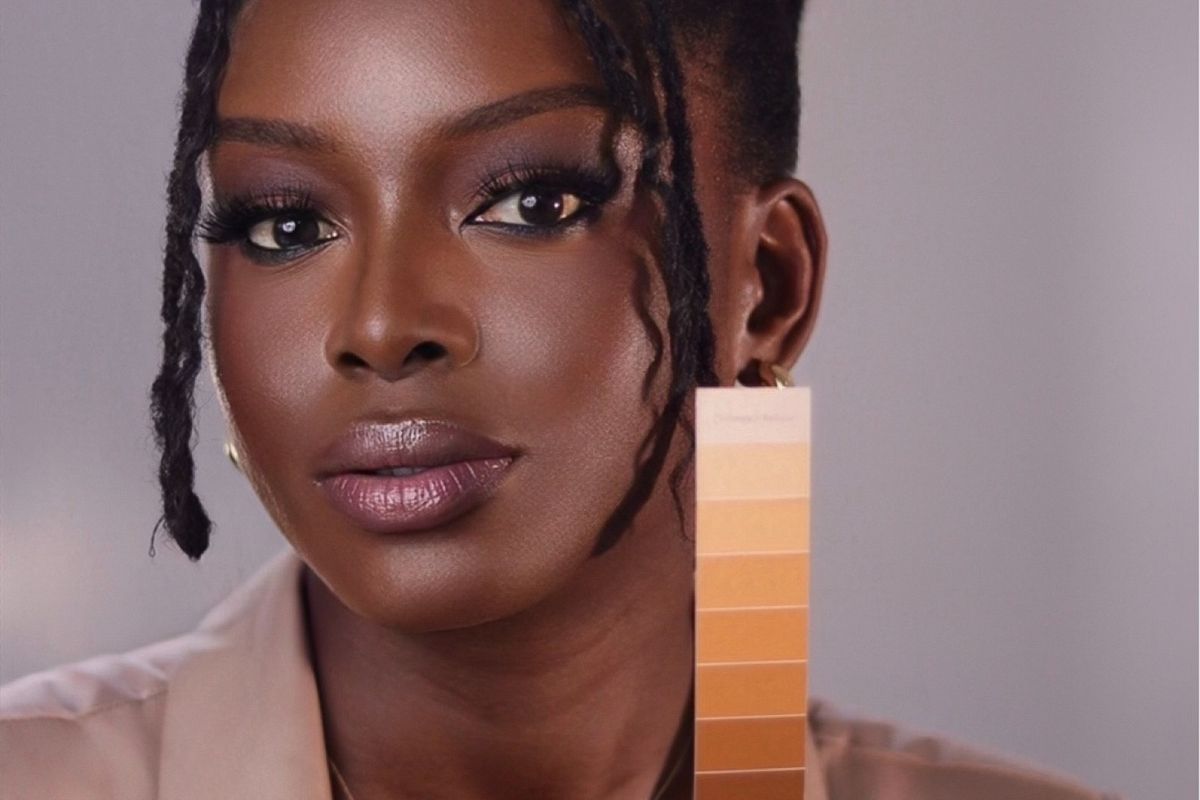
According to complexion educator and makeup artist Winifred Chiazor, colour matching comes down to three things: Shade, Undertone and Saturation.
Shade refers to how light or deep your complexion is.
Undertone is the underlying colour direction your skin naturally leans towards, such as yellow, peach, red or olive.
Saturation refers to how intense or muted that colour is.
Most of us know to think about Shade. Undertone gets some attention, usually through the familiar ‘Warm’, ‘Cool and ‘Neutral’ categories. Saturation, however, is rarely part of the conversation.
And understanding all three can explain why a foundation that appears to be the right depth can still look too orange, too yellow, too grey, too red or simply not quite right.
First, recognise the mistakes you might be making
Before we get into the fixes, see how many of these sound familiar:
1. You match depth but ignore undertone.
You find a foundation that looks like the right level of lightness or depth, but something about the colour still looks off.
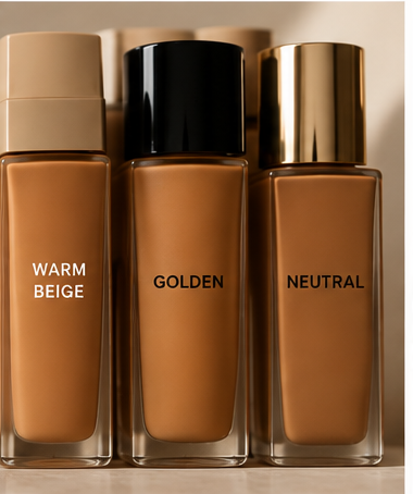
2. You trust the shade name.
“Warm Beige”, “Golden”, “Neutral” or “Deep” sounds informative, but shade names do not mean the same thing across brands.
3. You swatch on your hand or wrist.
It is convenient, but those areas may be a completely different colour from your face, neck and chest.
4. You match under whatever lighting is available.
The foundation looks perfect under the store lights, then different when you step outside.
5. You decide too quickly.
The foundation looks right immediately after application, but becomes darker or warmer once it has been sitting on the skin.
6. You match your face and forget the rest of your complexion.
A foundation can look right on one part of your face and still look disconnected from your neck or chest.
7. You assume there is one perfect shade in the bottle.
Sometimes the best match requires mixing two shades or undertones, particularly when a brand’s range does not quite cover your complexion.
If you’ve recognised yourself in one or several of these, here is what you need to know:
1. Matching depth isn’t enough
The most common mistake Chiazor sees is matching shade depth while ignoring undertone. It is also understandable because most people do not know their own undertone, and foundation labels do not always make it easier.
A brand’s “warm” may not correspond to what your skin actually needs. Two people can both be described as warm and still have very different colour directions. One might lean golden while another leans orange. This is why undertone needs to be considered alongside depth rather than treated as an optional extra.
And there is another layer that often gets missed: Saturation.
A real colour match involves the relationship between how light or deep the skin is, which colour direction it leans towards, and how intense or muted that colour is. So when a foundation looks too orange, yellow, red, grey or ashy, the problem may be undertone, but it can sometimes be saturation instead.
2. Stop treating shade names as a universal language
If you have ever found your shade in one brand and assumed that the same description would work elsewhere, you may have already discovered this one the hard way.
Shade names are not standardised across brands. A “warm” foundation from one brand can have a very different colour direction from another brand’s “warm” foundation.
That is why a label should be treated as a starting point rather than a guarantee. Understanding your own complexion is much more useful than assuming a familiar shade name will translate from one brand to another.
3. Your wrist isn’t your complexion
The back of your hand or wrist is easy to access when you’re shopping, which is probably why it became such a common place to test foundation. But it may not tell you much about how that foundation will look across your actual complexion.
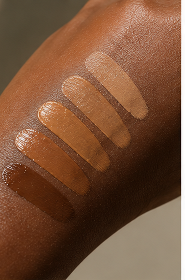
Your hand can be lighter, darker, warmer or cooler than the rest of your body. Even your face is not necessarily a perfect reference point because redness, sun exposure, hyperpigmentation and treatments can affect how it appears.
There is no single perfect spot to test foundation. Chiazor recommends swatching along the jawline, then checking the result against the neck and chest.
The aim is not to find a foundation that looks perfect on one tiny patch of skin. It is to find a colour that works across your overall complexion.
4. Don’t let the lighting choose your foundation
Lighting can completely change how a foundation appears.
Warm lighting can flatter the skin and make a foundation look better than it actually is, while cool or fluorescent lighting can make a product appear grey or ashy. Even the lighting at a beauty counter can be attractive without being particularly useful for colour matching.
Whenever possible, check your foundation in daylight before making your final decision. It gives you a much more honest view of how the colour actually sits against your skin.
5. Give your foundation time to change
Sometimes the problem isn’t the initial match at all. It is what happens after the foundation has been sitting on your skin.
Some formulas oxidise, meaning they shift in colour over time. Air, oils and the environment can all play a role. Some foundations barely change, while others can become noticeably darker or warmer.
Rather than deciding immediately after application, give the foundation 10 to 15 minutes, then check it again in daylight. That gives you a better indication of how the colour is actually going to look once it has settled.
6. Your face isn’t the only thing you’re matching
It is easy to focus entirely on the face because that is where the foundation is being applied. But if your face, neck and chest have naturally different tones, matching only one area can leave the overall result looking disconnected.
This is why looking at the jawline, neck and chest together is useful. You are considering the relationship between the areas rather than trying to make one small patch of skin disappear.
The goal is an overall complexion that looks cohesive, not a technically perfect match in isolation.
7. Your perfect match might be two shades
Finally, there is a misconception that the right foundation should always be one shade straight out of the bottle.
Sometimes a brand simply does not have your exact combination of shade, undertone and saturation. In those cases, mixing two shades or two undertones can create a much closer match.
Many people already do this instinctively without realising what they are correcting. They are compensating for a gap in the available shade range.
So if you have ever had to mix foundations to make one work for you, it does not necessarily mean you are unusually difficult to match. It may simply mean you needed a colour that the range did not provide.
So, what should you actually do?
Stop thinking about foundation matching as a hunt for one perfect shade number.
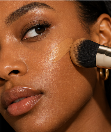
Chiazor’s advice is simple: learn your undertone.
But don’t rush the rest of the process. Test your foundation along the jawline, consider how it looks against your neck and chest, give it time to settle and check it in daylight before you commit.
Most importantly, stop thinking about foundation matching as a hunt for one perfect shade number.
Once you understand shade, undertone and saturation, you have a much better framework for understanding why something works, why it doesn’t and what you can do to correct it.
Because perhaps the problem was never that you were bad at finding foundation.
Maybe we were just taught to look for the wrong thing.